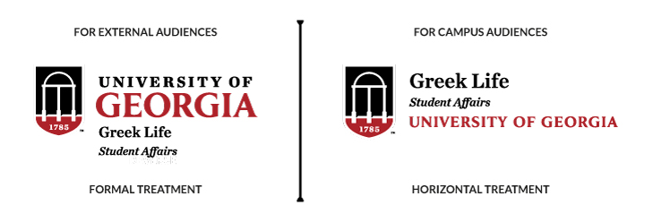
In the Student Affairs division and department logo sets, you’ll find options for “Formal” and “Horizontal” treatments. The preferred treatment for Student Affairs materials is the “Horizontal” treatment, with the department name at the top. Formal treatments are appropriate for pieces aimed at external audiences.
As part of the effort to tell the story of Student Affairs’ holistic effort to enhance the engagement, intellect and character of each student, Student Affairs departments are required to place their respective department’s logo on all communications, marketing and promotional materials.
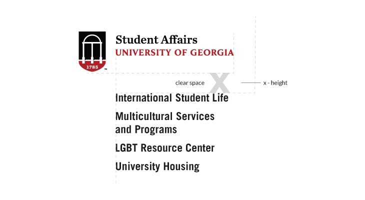
Generally, the logo shield with date should never appear less than 1/2” tall in printed materials, and no less than 36px tall in digital applications. Minimum size is determined by the height of the shield icon and applies to all configurations. The proportions of the type to the shield icon should never be altered. If an application requires the logo to appear between 1/2” – 3/8” tall, please remove the date. At this size, the date becomes illegible.
Click here to view the UGA Visual Style Guide section on “Minimum Size.”
The colors used in the university wordmark help make it a distinguishable element of Georgia’s identity. It is important to be consistent in the use of color. When one color or full color variations are used on black, red or dark backgrounds, the type and ™ reverse to white. Inks, presses, papers and screens vary considerably when it comes to rendering exact colors. For that reason, we highly recommend referring to the Pantone® Matching System (PMS) for consistent and accurate color reproduction.
Click here to view the UGA Visual Style Guide section on “Color Variation”.
Taglines can only be made by special request to the Division of Marketing and Communications.
Click here for more information about taglines.
Student Affairs departments and other University units collaborate often, and a logo treatment has been created to give recognition without placing multiple logos. The primary sponsoring department’s logo should be placed, and then either to the right of or below the logo, the collaborating departments should be listed in alphabetical order..
In the case of equal collaboration among Student Affairs departments solely, the Student Affairs logo should be placed, and then to the right of or below the logo, the collaborating departments should be listed in alphabetical order.
In the case of equal collaboration with other campus units outside of Student Affairs, the University logo should be placed, and then either to the right of or below the logo, the collaborating departments should be listed in alphabetical order, AND “Division of Student Affairs” should be included in the department listing.
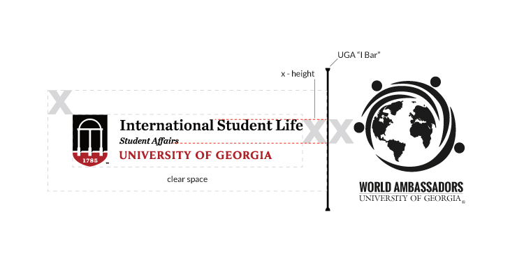
Student Affairs departments often co-sponsor events with student organizations and entities external to campus. For co-branding with organizations external to UGA, the UGA departmental logo is placed beside the external logo with the UGA “I Bar” separating the two. For student organizations that are advised directly out of a Student Affairs department, designers should utilize the co-branding treatments in the University Visual Style Guide. The department logo should be placed, and then the logo of the student organization may be placed. The same treatment may be applied to cases where a specific program has a defined or annually used logo. In cases where space is limited, alternate treatments may be produced, but the designer should default to the primary co-branding treatment whenever possible.
Click here to download the University “Expanding Column Separator ( I Bar )” graphic.
Social Media icons are created by the Division of Marketing and Communications and must be requested through the Division’s Logo Liason
The staff at Tate Print & Copy are trained in the division-specific visual style guidelines and are in direct communication with Student Affairs Communications and Marketing Initiatives. As such, they are best positioned to assist you with your department-specific design needs.